Font treatments
Selections - Compass Rose CPC + Bronze & Copper

MARK CONCEPTS
After completing my initial breakdown of the SCR brand, it was important for me to try to create a mark that would represent the brand in a few ways: could be shown alongside the full name or alongside SCR in logo usage, could stand alone while still representing the brand, could be utilized in different sizes, can be reversed out to display on dark background or light.
- In SCR, success is gauged in a variety of ways. It's not just about physical strength, it's about learning to love yourself, practice self care, and undergo somewhat of a "spiritual" change (whatever that means to you) in the way that you view life aside from, yet alongside, food and fitness. It's about a sort of metamorphosis.
- I wanted to explore the juxtaposition between strong geometric elements (such as the triangle ▽- representative of the uterus, and the female symbol ♀subtly placed), and the vulnerability and beauty of the subject itself.
- I didn't immediately pull from the word "chick" or "strong" because I didn't want to limit SCR to a pre-defined definition or image of femininity, or limit the brand to simply a fitness journey since it truly is so much more.
Rose concepts
Selection - Top right

Concept:
- Growth or blossoming
- Beauty, vulnerability, femininity
- Color options in digital versions can exhibit either a delicate nature or a strong darkness
- Incorporation of triangle mimics uterus and feminine power
- In Tarot the rose is considered a symbol of balance
- "In mythology, roses are associated with Aphrodite, who was often depicted adorned with roses around her head, feet and or neck
- In art of the renaissance period, a rose with eight petals was a message of rebirth and renewal
Moth concepts

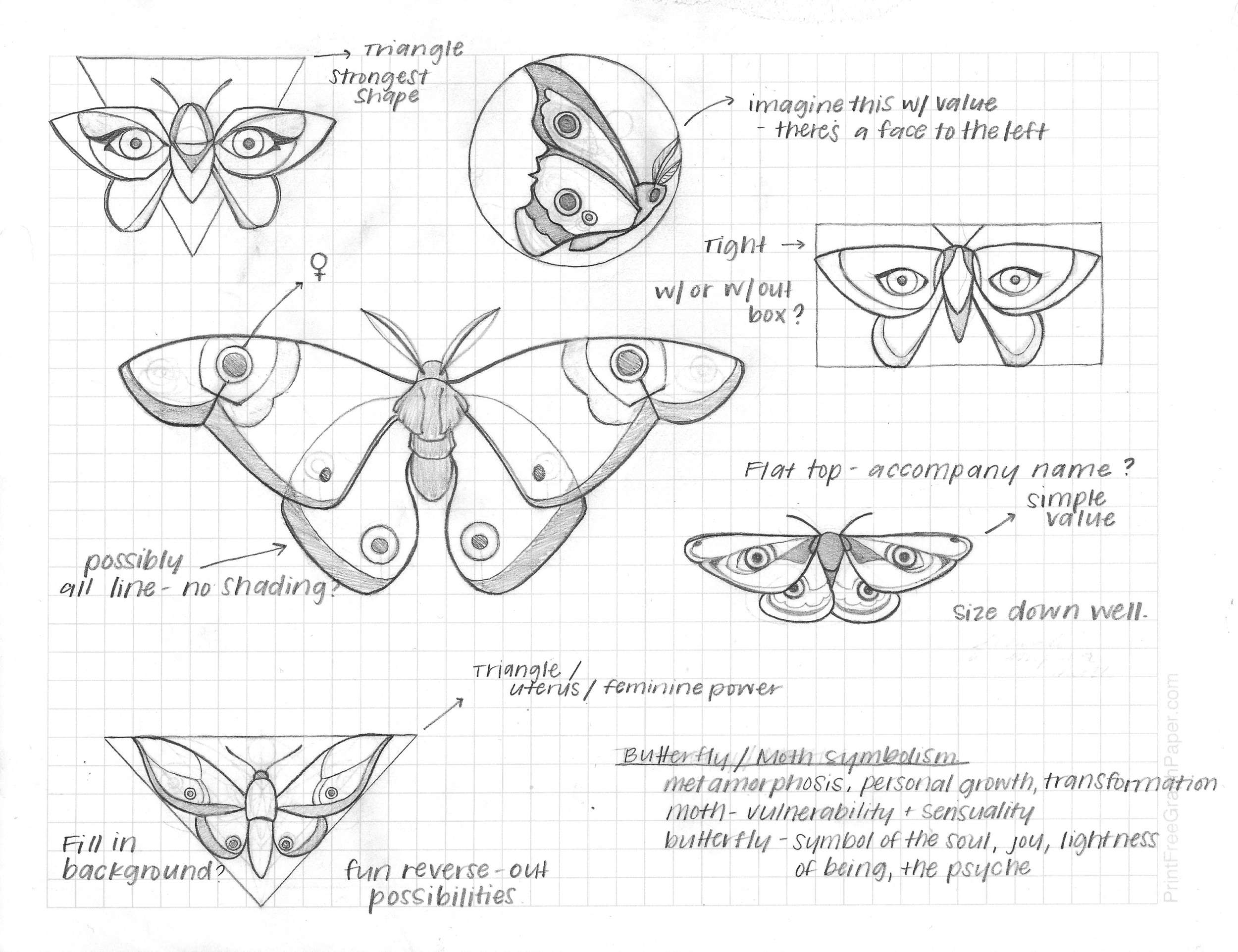
Moth Thought process:
To begin the process, I took time to really think about what SCR represents. I completed some word association as well as writing down some keywords that you use in your copywriting to describe the brand.
The literal idea of a metamorphosis that moths and butterflies experience was what drew me to the concept, but upon some further research, moths can represent vulnerability and sensuality, while butterflies are symbolic of the soul, joy, the lightness of being, and the psyche. They both have the common symbolic representation of personal growth and transformation.
Some of these words and ideas: empowerment, self care, girl gang, balance, vulnerability, physical strength, self love, community, honor, growth, confidence.
Ideas around the brand, goals in joining SCR: learning to love your body in every stage, becoming more in-tune with yourself, finding the "place between" ideas or achievements such as: vulnerability + strength, femininity + boldness, mental + physical strength, building a community of supportive women.
Symbolism: a crossroads, a metamorphosis, feminine power and energy, "the place between" where two points meet.